
Uncategorized
How to Make a DTF Print Feel Softer: Solid Designs, Open Space and Halftones
Oct
You have created a great-looking design, chosen a nice shirt and ordered a full-colour DTF transfer. Then you pick up the finished garment and notice the print much more than you expected.
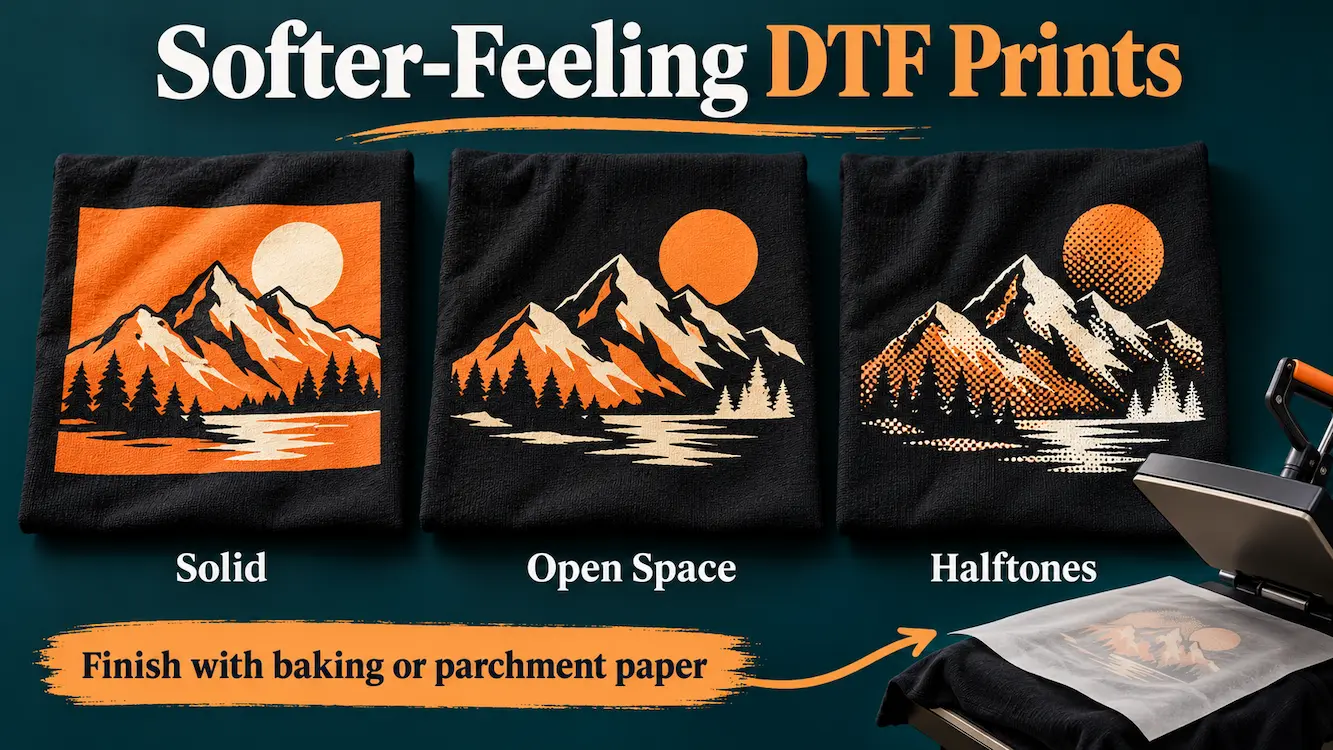
Sometimes the artwork explains the difference. A large, solid panel covers the fabric with one continuous printed area. A design with open spaces lets more of the original garment remain uncovered, even when the two designs occupy the same overall width and height.
To make a DTF print feel lighter, review its coverage and complete the application properly. Remove unnecessary backgrounds, use the garment colour within the design, choose a sensible print size and consider printable halftones where they suit the artwork. A finishing press with baking paper or parchment paper over the exposed design also makes a marked difference to how the print feels.
This guide covers those artwork choices and the finishing step. The comparisons below are design examples and a suggested testing method, not completed comparative test results or a promise of a particular improvement.
At a glance
- Hand feel describes how the finished print feels when touched and how it affects the garment’s movement.
- Overall print dimensions and actual printed coverage are different measurements.
- Transparent openings can reduce the amount of fabric covered by the transfer.
- Halftones help only when the artwork contains real, suitable gaps between printed elements.
- Lowering opacity is not the same as creating an open, printable design.
- Fine dots, outlines and lettering must remain substantial enough at the final print size.
- A finishing press with baking paper or parchment paper over the design has a marked effect on hand feel.
- Use the supplied pressing instructions; judge the cooled sample after the complete application process.
In this guide
- What makes a DTF print feel heavy?
- Solid artwork versus open artwork
- Use the garment as part of the design
- How halftones can help
- Keep dots and details printable
- Match the design to the garment
- A practical artwork preparation workflow
- Compare three versions before a full run
- The finishing press: baking paper or parchment paper
- Pre-order checklist
- Frequently asked questions
What makes a DTF print feel heavy?
DTF adds a printed structure to the garment, including colour, a white underbase where required by the production process and the bonding layer. The clear carrier film is removed during application; it is not intended to remain on the shirt.
How noticeable the finished print feels depends on several things:
- Coverage: how much fabric is occupied by printed artwork.
- Continuity: whether that coverage forms one large panel or is separated into smaller elements.
- Scale and placement: how large the design is and where the garment needs to move.
- Fabric: the weight, knit, stretch and drape of the actual garment.
- Transfer and application: the production materials and whether the product is applied correctly.
Artwork is the part you can review before ordering. Changing it can reduce coverage, but it does not turn the printed layer into bare fabric or guarantee a particular hand feel.
An unexpectedly rough or stiff result also deserves a product and application check, including the finishing press and cover sheet. Send your supplier the artwork, order details, garment information and settings rather than assuming every problem comes from the design.
Solid artwork versus open artwork
Imagine a 25 × 30 cm design. Its bounding rectangle covers 750 cm², but that does not tell you how much of the rectangle will actually be printed.
A filled rectangular background can occupy the whole area. Separate lettering and an illustration with transparent space between them can sit within the same dimensions while covering substantially less fabric.
| Approach | Artwork structure | Main trade-off |
|---|---|---|
| Solid panel | A continuous printed background with the design on top. | Strong block of colour, with the most continuous coverage in this example. |
| Open design | Lettering and illustration separated by genuine transparent areas. | More uncovered fabric; contrast depends partly on the garment colour. |
| Selective halftones | Important details stay solid while selected fills or shading use separated dots. | A different texture and less coverage in those areas, with extra preparation and detail checks. |
There is no need to force every design into the third option. A compact solid logo may suit the job perfectly. The useful question is whether a large filled area serves the design or is simply left over from the original image.
Use the garment as part of the design
Negative space is the area you deliberately leave unprinted. On a garment, it allows the fabric to become part of the composition.
For a black shirt, you might remove a large black background and let the shirt provide that colour. Open lettering, separate shapes and spaces between illustration details can retain a strong visual design without filling every part of its rectangle.
Useful changes include:
- Removing an unnecessary background panel.
- Leaving clear space between the headline, illustration and supporting text.
- Using substantial outlines or separated shapes where a solid fill is not essential.
- Opening large decorative areas while keeping the main subject readable.
The openings must be transparent in the supplied file. A white area in a PNG is still printable white artwork. A black area on a black-shirt mock-up is still printable black artwork unless you intentionally remove it.
Be selective with colour removal. Deleting every black pixel can also remove facial features, lettering, shadows and outlines you wanted to keep. Make separate versions for different garment colours when needed, and inspect each over a background that resembles the intended shirt.
Our T-shirt design guide explains how hierarchy, contrast and spacing help a design remain readable.
How halftones can help
A halftone represents tone or shading through a pattern of printed elements, often dots. From a normal viewing distance, the pattern can suggest a shade or fade while leaving open spaces within it.
For this purpose, those spaces need to be genuinely unprinted. A picture of dots over an opaque white rectangle still includes the white rectangle. It has the appearance of a halftone without the intended open structure.
Choose the areas that benefit
Halftones can suit selected illustration shading, broad decorative fills or a fade into the garment. Keep a business name, small text or an important logo element solid when clarity matters more than a textured effect.
Halftone elements can contain printable colour; they do not have to be black. The practical aim is a controlled pattern with reliable printed elements and suitable clear gaps.
Opacity is a different change
Turning an entire image down to 50% opacity creates partially transparent pixels. It does not remove half the artwork into clean, open areas. The white underbase and adhesive still have to be handled by the printing process, so the screen preview can be misleading.
Prepare a suitable halftone for a fade into transparency rather than relying on a soft, faint edge. Read the artwork requirements for guidance on fades, shadows and partially transparent pixels.
Keep dots and details printable at their final size
A pattern can look excellent when enlarged on a monitor and become too delicate on a small chest print. Both the printed elements and the spaces between them need checking after scaling.
Our artwork guidance warns against details narrower than four pixels in the final supplied file. For isolated elements, approximately 1 mm of printable substance is a safer practical target where the design allows. These are different measurements: at 300 DPI, four pixels is about 0.34 mm.
For a halftone, inspect:
- The smallest printed dots at the light end of the pattern.
- The narrowest clear gaps at the darker end.
- The transition between patterned and solid areas.
- Small text, thin outlines and disconnected details.
- Any faint pixels or haze left around the outside edge.
There is no single halftone frequency that suits every artwork size and transfer system. A dense pattern can close up; a very open pattern can lose detail or change the image too much. Choose a pattern for the actual output size and test it physically.
When preparing adult, youth and chest-logo versions, consider rebuilding the pattern for each size instead of shrinking one finished raster file repeatedly.
Match the design to the garment
The same print may be more noticeable on a light, fluid training top than on a heavier casual shirt. Fabric weight alone does not decide the result, but the actual garment is an important part of choosing the artwork.
A smaller logo or a more open layout may suit lightweight activewear. A large statement graphic may be appropriate for a heavier lifestyle tee. Check how the garment bends and moves in the placement you are considering.
Use our transfer size guide and activewear printing guide when planning different sizes and garment types.
Hand feel, stretch, air permeability and wearer comfort are related considerations, but they are not interchangeable measurements. Leaving fabric uncovered does not justify a numerical breathability claim without appropriate testing.
A practical artwork preparation workflow
- Choose the garment and placement. Decide the shirt colour, usable print area and intended finished dimensions.
- Keep a master file. Make your changes in a separate version so the original can be recovered.
- Review the background. Remove only the parts that do not need to be printed.
- Create purposeful openings. Preserve the main message, important shapes and contrast.
- Add halftones selectively. Use them where their texture suits the design, with actual transparency between printed elements.
- Check the final size. Inspect the smallest elements and gaps after every size change.
- Export the final PNG. Preserve transparency and aim for 300 DPI at the intended physical size.
- Inspect the exported file. Place it over both light and dark backgrounds to reveal boxes, halos and stray pixels.
- Order and apply a sample. Confirm appearance, feel and garment behaviour before committing to a larger quantity.
A design application or halftone tool needs to produce the file you actually intend to supply. Check its output rather than assuming a “DTF” preset has removed backgrounds or protected fine detail. Our Photopea preparation guide can help with general image setup and transparent PNG export.
Compare three versions before a full run
A small comparison is often more useful than making one major change and hoping for the best. Here is a suggested trial using the same illustration at the same overall dimensions:
- Version A: keep the original solid background or large fill.
- Version B: remove the unnecessary panel and introduce deliberate transparent openings.
- Version C: keep the open layout and use suitable halftones in selected shading or fill areas.
Print and apply the versions using the same transfer product, garment style and supplied method. Give each version the same finishing press, using the same baking paper or parchment paper. Compare cooled samples for appearance, bending, handling and intended wear. Record what you changed and which version best balances feel with readability.
This is a proposed comparison, not a report of measured results. Do not turn a subjective preference into a percentage improvement unless you have defined and measured that property. If the garments will be sold, include the relevant wash and wear checks before approving the design.
Our DTF testing guide includes a record checklist. You can arrange several test versions on a gang sheet, then compare the pressed samples rather than relying only on their screen previews.
The finishing press: baking paper or parchment paper
In our workshop experience, doing the finishing press with baking paper or parchment paper over the exposed design has a marked effect on how the print feels. This step deserves attention when you are trying to achieve the intended finished hand feel.
Artwork preparation determines where the print sits. The finishing press is part of completing that print on the garment. Review both before deciding that a design needs to be changed.
Complete the finishing step for the product
- Apply the transfer using the instructions for the product and fabric.
- Remove the carrier at the correct peel stage. Standard cotton Insta-Peel is peeled immediately while hot; polyester must cool completely before its cold peel.
- Place suitable clean baking paper or parchment paper over the exposed design.
- Complete the specified finishing press.
- Remove the paper and let the garment cool before comparing its feel.
For our standard Insta-Peel instructions, the finishing press is 10 seconds at 140°C for cotton and most suitable fabrics, or 10 seconds at 120°C for polyester. Use the appropriate firm pressure and follow the current fitting instructions. Specialty and dedicated iron-on products have their own methods.
Keep the paper type and finishing method consistent across a sample comparison. Otherwise, differences in the finishing step can be mistaken for differences caused by artwork alone.
A finishing press does not remove a large solid background or create openings that are missing from the file. You can use thoughtful artwork and a properly completed finishing step together.
Reducing heat, time or pressure to chase a softer feel can leave an inadequately applied print. Likewise, extra pressing is not a universal remedy: follow the specified process rather than repeatedly adding heat.
Do not peel, scrape or try to thin the applied design. If the result is unexpectedly heavy or rough, investigate the file, transfer product, garment and application method with the supplier.
Follow the care instructions after application. Washing is part of caring for the garment; it should not be presented as a dependable way to repair unsuitable artwork or an application problem.
Pre-order checklist
- Does the design need every large filled area?
- Can the garment supply part of the background colour?
- Are the openings genuinely transparent?
- Do the important words and shapes remain readable?
- Are halftone dots and gaps suitable at the final print size?
- Have you checked each garment-size version?
- Is the exported file clean on both light and dark backgrounds?
- Have you planned a physical sample on the actual garment?
- Will you complete the correct finishing press with suitable baking paper or parchment paper before judging the result?
Frequently asked questions
Why does my DTF print feel like a thick patch?
Large, continuous coverage can make a print more noticeable, especially on a lightweight garment. The transfer materials, application and finishing press also matter. Check that the complete method was followed before diagnosing the cause from feel alone.
Does a finishing press with baking paper or parchment paper change the feel?
Yes. In our workshop experience, it has a marked effect on the feel of the exposed design. Follow the finishing instructions for your product and fabric, then judge the sample after it has cooled.
Do halftones always make DTF feel softer?
No. They can reduce coverage when suitable gaps replace a solid fill. A dense pattern, an opaque background or a poorly matched garment may not give the result you want. Compare a physical sample.
Can I lower the image opacity to reduce the printed layer?
Do not assume that lowering opacity will produce a thinner or more comfortable transfer. It creates partially transparent artwork that the print workflow still has to reproduce. Use deliberate openings or suitable halftones instead.
Will white areas be left unprinted?
No. White is a printable colour. Areas intended to show the garment need to be transparent in the supplied artwork.
Can a halftone improve a photograph?
It can create a particular graphic style or open selected areas, but it also changes detail and texture. Keep important facial features and small details clear, and approve the printed sample rather than assuming the pattern improves every photograph.
Does reduced coverage make the transfer cheaper?
Not automatically. Our sheet formats and ordered film area determine the relevant pricing. Removing background pixels can change feel without changing the layout’s overall dimensions. Check the product and final sheet arrangement.
Can I supply a halftone file for printing?
Yes, if the final file meets the artwork requirements. Supply the finished, correctly sized transparent PNG and review it carefully. The artwork is printed as supplied; automatic halftone conversion or redesign is not included.
What if a completely solid design is essential?
Keep the design’s purpose in view. Consider its size, placement and garment, then test the result. If the required look and feel cannot be achieved with that combination, compare other decoration methods; our DTF versus screen printing guide explains useful considerations.
Plan for the person wearing the shirt
A strong garment graphic needs to work off the screen too. Start with the artwork’s purpose, remove unnecessary coverage and keep the remaining details robust. Complete the proper finishing press with baking paper or parchment paper, then use a cooled physical sample to decide whether the design suits the shirt and wearer.
Explore our standard DTF gang sheets or cut sheets for prepared artwork. If you are new to our standard film, the free sample pack can help you become familiar with that product; your own artwork still needs its own trial.
For help choosing the appropriate transfer, contact our team at 17 Castlemaine St, Coorparoo QLD 4151.
About the author: David Seth owns DTF Transfers Australia and The Custom T Shirt Shop group. Learn about the Coorparoo workshop and team on our About page.
