
Artwork and Files
T-Shirt Design Trends: Fresh Ideas That Work in Print
Mar
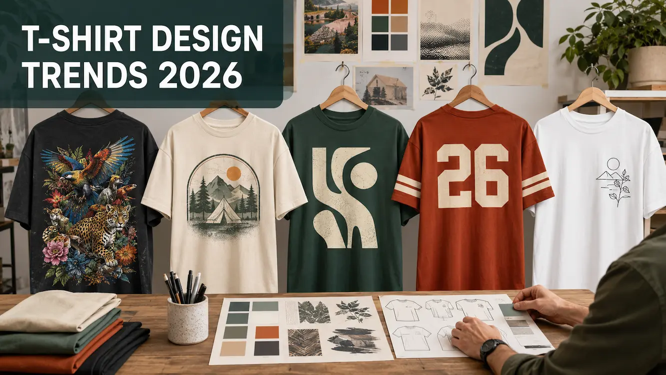
T-shirt design trends are useful starting points for original artwork. Bold lettering, handmade textures, playful illustration and local stories can all give a range a fresh direction. The best choice is the one that suits your customers, works with your garments and looks good as a real print.
A design can attract attention on a screen without becoming a shirt someone wants to wear. Before building a collection around a trend, consider the message, print size, garment colour and finished feel.
This guide brings together current creative signals and practical T-shirt design ideas, with advice on adapting them for direct-to-film (DTF) transfers and testing a small release.
TL;DR
- Use trends as inspiration. Build your own message, illustration or local reference around the visual direction.
- Separate forecasts from demand. A design report can suggest ideas; it cannot tell you which shirt your customers will buy.
- Design for the garment. Choose the blank, colour and placement while developing the artwork.
- Prepare texture deliberately. Rough lettering and distressed graphics still need clean, properly sized files.
- Check the physical result. DTF can reproduce detailed colour, but large solid prints feel different from open designs.
- Start with a sample or small range. Use customer response and actual orders to decide what to expand.
What current trend reports can tell you
Adobe’s 2026 graphic design forecast highlights expressive lettering, imperfect handmade visuals, surreal imagery and local cultural references. These are broad creative directions across design and marketing, rather than a ranking of Australian T-shirt sales.
Our interpretation for apparel is to explore graphics with a clear personality: a distinctive message, an original drawing or a connection to the people wearing the shirt. The suggestions below show ways to test those ideas alongside established approaches such as retro layouts and understated branding.
| Direction | Possible T-shirt application | Check before printing |
|---|---|---|
| Handmade character | Original brush lettering or sketch-based graphics | Fine marks remain printable at the final size. |
| Expressive typography | A short phrase with a distinctive lettering style | The message is easy to read on the garment. |
| Playful illustration | An original mascot, visual joke or unexpected scene | The main subject is clear without close inspection. |
| Retro or sporting layouts | An original badge, club graphic or event design | The artwork has its own identity and approved assets. |
| Local connection | Your own drawing of a place, plant or shared experience | The reference means something to the intended customer. |
| Restrained placement | A small mark, short phrase or simple line drawing | Line weight and contrast are sufficient on the actual fabric. |
Use overseas seasonal reports carefully. Match ideas to your Australian launch timing and audience rather than assuming a Northern Hemisphere summer forecast fits your release schedule.
Make a trend your own
Look at what makes a style appealing before trying to use it. Is it the humour, colour palette, lettering, texture or sense of belonging? That gives you a starting point without needing to reproduce someone else’s finished design.
For example, a nostalgic souvenir layout could become an original graphic for a local camping group. Keep the broad idea of a badge and limited palette, then develop your own illustration, wording and arrangement.
A useful design brief can be one sentence: “An original bird illustration with bold club lettering for people who enjoy early-morning walks.” That is easier to develop consistently than a folder of unrelated images.
If you are building a label, use the same filter across the range. Our guide to creating your own T-shirt label explains how to connect the artwork with a recognisable brand.
Handmade textures and rough-edged graphics
Hand-drawn lines, brush marks and cut-paper shapes can give a design character. Use something you have made yourself: scan a drawing, photograph painted lettering or build a texture from your own materials.
The useful distinction is between an intentionally rough appearance and a poor-quality file. Lowering the resolution is not a reliable way to create a vintage effect. It can simply leave the print with blurred or jagged edges.
Build the texture at the intended print dimensions. Keep important strokes strong enough to survive printing, and simplify isolated specks that contribute little to the design. Check distressed lettering especially carefully; its gaps should look deliberate rather than make the words difficult to read.
Idea to try: combine one original brush-drawn subject with clean supporting text. The contrast can give the shirt personality without making every part of the layout busy.
Bold lettering and simple statements
A short phrase can carry an entire T-shirt design when the wording and type work together. Start with what you want to say, then choose lettering that suits its tone.
Test the main phrase from a few steps away. If the message only makes sense when enlarged on your monitor, it may need fewer words, stronger contrast or more space between letters.
Use one clear focal point. Supporting text can add context, but it should not compete with the main message. Check spelling and punctuation in the final file, including any text that has been distorted, curved or converted into artwork.
When a smaller design works better
A small chest mark or restrained line drawing may suit customers who want a shirt they can wear often. This is an alternative design choice, not evidence that every trend needs to be bold.
Minimal artwork makes spacing, placement and garment quality more noticeable. Do not make the details so fine that they disappear in the fabric or fail to print reliably. A tonal design still needs enough contrast to look intentional.
Playful illustration and detailed artwork
An original character, unusual combination of objects or small visual joke can give customers a reason to look twice. Start with a strong silhouette and a clear idea before adding background details.
Detailed artwork can also suit artist merchandise and small collections built around a theme. Keep the main subject recognisable when the shirt is worn, where folds and movement change how the image appears.
DTF is useful for full-colour illustrations, gradients and irregular shapes because the colours are printed together. However, a large solid background creates more coverage than a design with open space. Remove the background when it adds nothing to the composition, rather than automatically printing the whole rectangular artboard.
Idea to try: develop one original character in three related scenes. Keep the lettering and palette consistent, then test which scene customers prefer before extending the series.
Retro and sport-inspired design
Retro layouts offer a flexible visual vocabulary: curved lettering, badges, halftones and limited colour palettes. You can use those ingredients to tell a new story rather than recreate old merchandise.
A weathered appearance should come from deliberate artwork choices. Keep the source file sharp and sufficiently detailed, even when the final design is intended to look worn.
Numbers, crests and club graphics
Sport-inspired layouts can suit a real club, event or group identity. Use an approved name, original crest and meaningful details, such as an actual event date. Avoid adding a made-up history simply to make the shirt look established.
A detailed multicolour crest may suit DTF, while a large single-colour back number may be practical in cut heat transfer vinyl. Our DTF and cut HTV comparison explains the production differences.
A small front graphic and larger back design can work together, but treat them as one composition. Check how both placements look on the garment rather than sizing each in isolation.
Local stories and personalised collections
Local references can make an otherwise familiar style more specific. Think about what your customers recognise: a shared activity, an original drawing of a local plant, or a phrase associated with your own group.
Use your own photographs and observations as source material. A carefully drawn detail from a familiar place can be more distinctive than a generic collection of “Australian” symbols.
Where a design draws on an artist’s or community’s cultural material, develop it through an appropriate collaboration and agree on how it will be used and credited.
Keep small collections manageable
Personalisation might involve names, locations or a choice between a few illustrations. Offer options you can check and produce consistently, rather than allowing every element to change.
For names, test short and long examples in the layout. Confirm spelling and record the approved design against the correct garment. A simple ordering system matters as much as the artwork when each item is different.
Different standard DTF designs can share a gang sheet, which can make a small collection practical to sample. Plan the sheet around final print sizes and leave enough space to separate the transfers.
Garment, colour, placement and finish
The blank T-shirt is part of the design. Choose the fit, fabric and colour early enough to influence the artwork.
Measure the printable area on your actual garments. A large back print that looks balanced on one size may sit too close to seams or feel oversized on another. Decide whether the range needs more than one print size.
Check placement on a worn sample as well as a flat shirt. Collars, sleeves, seams and folds all affect the result. The T-shirt fabric guide can help you compare blank garment terminology.
Build a palette around available garments
Start with one or two garment colours you can source consistently, then develop the print palette against them. A design that looks clear on white may need adjustments for black or a strongly coloured shirt.
Use mock-ups to compare options, but approve a physical sample when colour matters. Screen brightness and digital colour effects do not predict an exact printed result.
Use an effect when it supports the idea
Metallic, glitter, pearl, reflective and glow finishes can make a simple design distinctive. A metallic-looking gradient in an ordinary colour file, however, does not create a genuinely metallic surface. Choose the appropriate product for the effect you want.
Check whether a speciality effect applies across the artwork or to selected areas. Photograph a finished sample under conditions that show its real appearance, and review the available DTF transfer products for product-specific limitations.
Do not assume that a speciality transfer uses the same application method as standard DTF. Follow the relevant transfer fitting instructions and test the intended garment.
Prepare your design for DTF printing
A strong concept still needs a print-ready file. For our DTF orders, prepare a transparent PNG at 300 DPI at the final print dimensions and check the current DTF artwork requirements.
- Set the physical size first. Enlarging a small image does not restore missing detail.
- Check transparency. Remove unwanted backgrounds and inspect edges against the intended shirt colour.
- Review fine elements. Small text, distressed specks and thin strokes must be substantial enough to print and adhere.
- Check gradients and fades. Colour gradients and semi-transparent edges are different; sample artwork that relies on fading into the garment.
- Crop the file carefully. Remove unnecessary empty space and confirm the final dimensions.
- Proofread the finished export. Check the actual file being uploaded, not just the editable working version.
Our service prints artwork as supplied. Build file checking into your design process rather than assuming spelling, backgrounds or sizing will be corrected during production.
AI tools and original artwork
AI can help explore a composition or generate variations, but “AI-generated” is not a design direction by itself. Decide what the shirt should communicate and use the tool to support that brief.
Review the result closely. Check lettering, anatomy, repeated objects, stray marks and edges. Rebuild important text with proper typography where needed, and prepare the final artwork at its intended print size.
A mock-up can help you choose a direction, but it does not prove how the garment fits or how a transfer will look. Photograph the physical sample for product listings once it is available.
Check the sources behind your design
Before selling a design, check the commercial-use terms for the images, fonts, tools and other assets involved. Keep the relevant licence and permission records with the artwork.
Use trend references to develop an original composition. If a design depends on another brand, character, artist’s work or cultural material, resolve the permissions before ordering. Our guide to copyright issues in T-shirt design provides a starting point for that review.
Test the idea before launching a range
Choose one clear concept and make a complete sample. This provides better information than a large set of unfinished designs.
- Define the customer. Decide who would wear the shirt and why.
- Write a short brief. Identify the message, visual direction and original subject matter.
- Select the garment. Confirm fit, colour, available sizes and print area.
- Prepare and check the artwork. Review the file and its source permissions.
- Print and apply a sample. Check scale, placement, colour, feel and performance under the intended care instructions.
- Photograph the finished shirt. Show the fit, print and relevant details clearly.
- Release a manageable first range. Use the response to decide what deserves another run.
Look beyond likes
Ask potential customers what the design means to them and when they would wear it. Look for confusing details or practical objections, not just a positive reaction to the image.
Once the product is available, compare actual orders, sizes selected, questions and feedback. Keep the presentation reasonably consistent when comparing designs, so differences in photography or price do not obscure what you are trying to learn.
For product-page wording and photography, read our guide to writing useful T-shirt website content.
Plan quantities and describe choices accurately
A small release lets you learn before committing to a large quantity of decorated stock. Efficient gang-sheet layouts and careful sampling can also help reduce avoidable production mistakes.
Describe those specific choices rather than calling a product “sustainable” because it uses DTF or a particular fibre. Keep evidence for any environmental claim you make and check supplier information before repeating it.
Frequently asked questions
What T-shirt design trends are worth exploring in 2026?
Current creative forecasts suggest directions such as expressive lettering, handmade visuals, playful imagery and local references. These can inspire T-shirt designs, but they are not proof of demand for a particular garment or print. Test the ideas with your own audience.
Can I still use retro or minimalist designs?
Yes. A design does not need to match the newest forecast to suit your customers. Develop an original concept and focus on the garment, message and finished quality.
What designs work well with DTF transfers?
DTF can suit full-colour illustrations, photographs, gradients and irregular shapes, as well as simple graphics. File quality, detail size and total print coverage still affect the finished result.
Will a large DTF print feel the same as a small one?
Not necessarily. A large solid design covers more fabric and can feel more substantial. Compare a sample at the intended size rather than judging from a small test logo.
Should I change the design for different shirt sizes?
Check the proportions and available print area across the size range. One print size may work, but some ranges benefit from a smaller or larger version. Confirm this with the actual garments.
Can I use AI-generated artwork?
AI can assist with design development. Review the tool and asset terms, check the resulting artwork and prepare it properly for printing before offering the shirt for sale.
How many designs should I launch at once?
Start with a number you can sample, photograph and manage properly. A small, coherent collection makes it easier to understand customer response before adding more options.
Do I need a physical sample if the mock-up looks good?
A physical sample shows colour, placement, texture and fit that a mock-up cannot confirm. It is a valuable check before committing to a commercial release.
Turn your next idea into a wearable design
Choose a direction that fits your audience, give it an original subject and develop it around the garment. Then use a sample to confirm that the idea works beyond the screen.
When your artwork is ready, you can order a custom DTF gang sheet to test a small collection. If you are new to transfers, our DTF transfer printing guide explains the ordering and application process.
